Journeys with maps: on cartography and its discontents
The first in a series of (probably) three essays, loosely about maps
“How is this better than an app?”
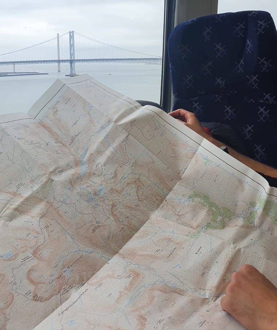
I am grappling with an Ordnance Survey map, on a crowded train, at a table that’s much too small. I am on the North Sheet, and I want the South Sheet, and that means unfolding the whole thing and redoing all the folds in the opposite direction, and I have probably just swiped the questioner across the face or poked him in the eye with a pointy bit of laminated cartography. Still, the question surprises me, and I have to think for a moment.
“It isn’t,” I say eventually.
The paper map is a faff to carry, and it’s clearly a menace to fellow train passengers. It’s considerably less waterproof than a smartphone; it’s more likely to blow away on a mountain; and crucially, it doesn’t have a little cerise-coloured arrowhead telling me exactly where I am and where I’m going. There are some advantages, of course: it won’t run out of battery, and its size makes it a bit easier to trace a long section of our route without having to scroll around on a tiny screen. But it isn’t better.
It isn't better: but perhaps it makes me better?
Without a little GPS pointer I need to work out where I am as well as where I want to go. This means paying more attention, not just to the trivial details of where one path forks into two, but to the landscape on a grander scale: it means knowing which peak is which, where the nearby valleys lead, and which of the rocky spurs across the glen is the ridge-line we are hoping to ascend tomorrow. In an admittedly glib sort of way, this is spiritually important. Paying attention is a good thing. And how can you really know where you want to go if you haven’t had to do the work of finding out where you are now?
I respond along these lines and go back to my big flappy map, but over the course of a few more days I start to wonder whether I really believe it. It’s enjoyable to be romantic and Luddite about these things, and it even gives a slight feeling of superiority, but it’s only ever a whisker away from smugness and hypocrisy. I am worried I might have crossed the line already.
It’s undoubtedly true that our navigational tools make a difference to how we see the world we’re trying to navigate: but an OS Explorer map is already a very sophisticated, hi-tech media product, and it imposes its own frame of reference on the world just as surely as the smartphone version. My map isn’t better on a practical level, and I’m not at all sure it’s better on an intellectual or spiritual level either.
Growing up with maps all around us, most of which take similar approaches to representing three-dimensional landscapes at scale in two-dimensional form, it’s easy to fall prey to the assumption that there’s something universal or absolute or ‘right’ about this way of codifying the world. But maps are simply a form of communication; there are many possible languages, and like any form of language, they inevitably shape and distort reality in the act of revealing it. The history of cartography can be read as a kind of dance between how maps are used and what they mean: a dance in which the purpose of the map dictates its form, and the meaning emerges as a side-product that then takes on a life of its own.
Different mapping languages seem to have existed, and co-existed, for a very long time. Neolithic rock carvings have been interpreted as providing geographical and topographical information in a variety of forms, and have also been identified as maps of the moon. Ancient Mesopotamian cultures produced town plans in a relatively familiar 2D format with compass points identified, but they also codified geographical information in lists of names and itineraries. Star charts have existed for thousands of years, and ancient Egyptian cartographic depictions seem to have depicted aspects of the afterlife before they started depicting the world of the living. The first known ‘world map’, from the neo-Babylonian period, is highly symbolic, showing Babylon at the centre of a disc-shaped world, with the Euphrates and several surrounding cities portrayed within the encircling ‘Bitter River’.
Chinese cartography became highly sophisticated from at least the time of the Han dynasty (206 BCE to 220 CE), with the development of scales and gridlines, although relatively few map fragments survive today. Greco-Roman culture, too, developed very recognisable maps (no map drawn by Ptolemy survives, but his Geography provides clear and detailed map-making instructions that Renaissance scribes followed and embellished with great enthusiasm.) On the whole, though, the intensely pragmatic Romans seem to have been more interested in accurate itineraries, providing ready-to-use information on routes and distances along the Empire’s extensive road network, rather than wasting time on precise visual representations.
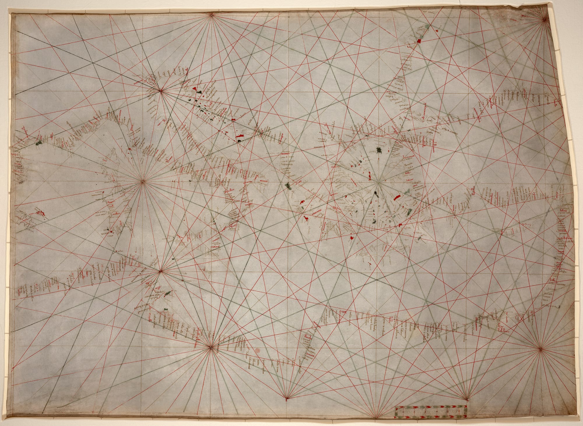
At sea, too, the ‘periplus’, or ‘rutter’, a navigational handbook listing ports, hazards and sailing instructions, was far more useful for coast-hugging sailors than any hand-drawn map was likely to be. It's utility rather than scholarship, too, that generated some of the first maps that really ‘look right’ to modern eyes: the portolan charts that circulated among mediaeval sailors seem to have been developed from the compass bearings given in rutters, rather than being created with any specific and consistent methodology for projecting globes onto flat surfaces, but their depictions of Mediterranean coastlines appear astonishingly accurate when compared to the scholarly world maps of the same period.
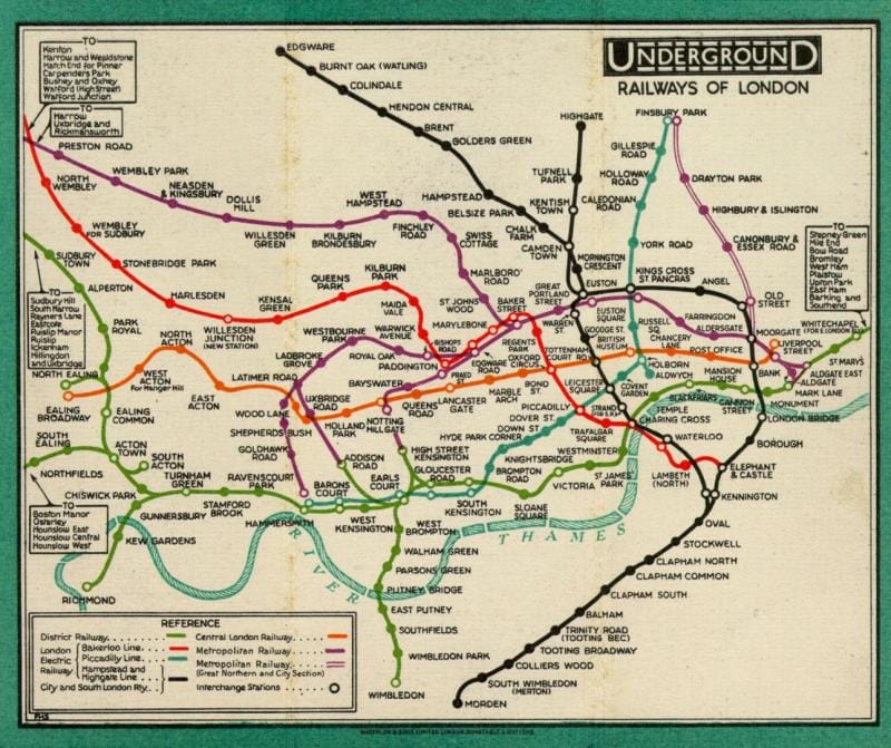
The point is that mapmaking hasn’t been a matter of linear progression from ‘crude’ early attempts to the more ‘advanced’ scale maps we now take for granted. Just as a metro map that organises information about lines and stations in an efficient and accessible way is much more useful than one that conforms needlessly to above-ground distances, so cultures all around the world and throughout history have organised cartographic information in ways that best served their purposes at the time. There’s never been one ‘true’ way of mapping the world: bureaucrats, sailors, soldiers and priests have all taken different approaches depending on how they want to use their maps. And anyone who thinks we've cracked it now clearly hasn't tried using satnav to find the right sliproad on a complicated motorway junction, or using Google Maps to find their way around an area with streets criss-crossing on different levels (like Edinburgh's Old Town).
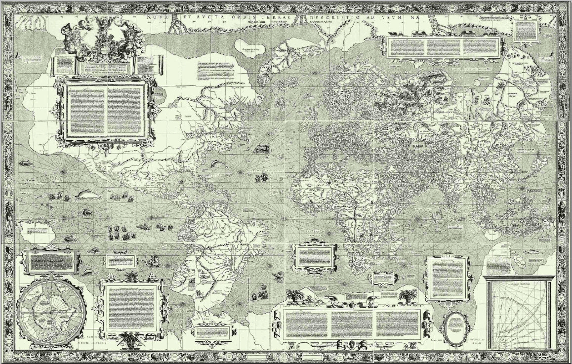
A perfect representation of a three-dimensional world in two dimensions isn't just a technical challenge, it's a mathematical impossibility. And so we come to perhaps the most infamous cartographic distortion of all, the Mercator projection: a prime example of how a map is developed to serve a particular purpose, but ends up freighted with all sorts of troublesome meanings too.
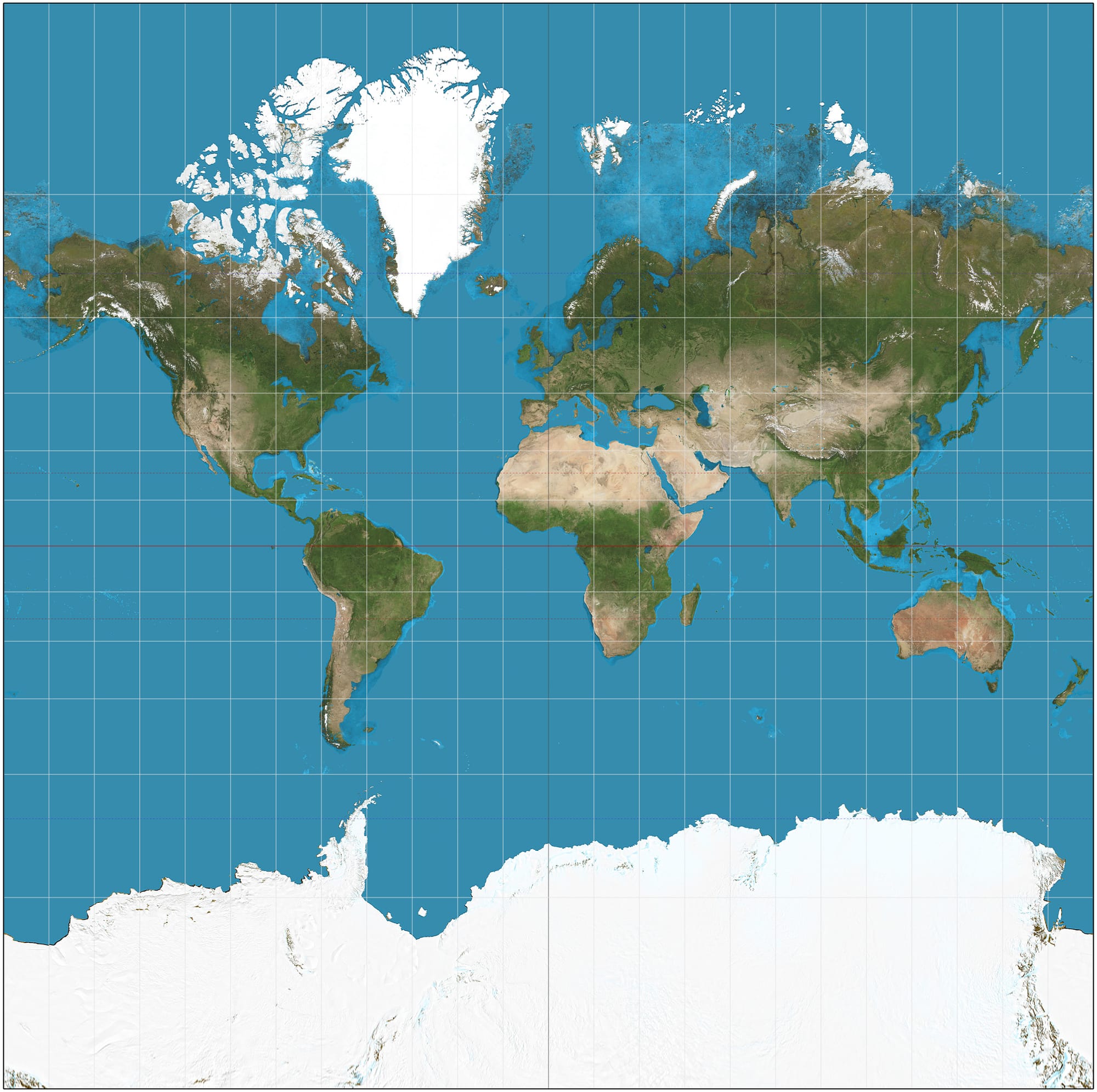
The world map we now think of as standard—the one that adorned nineteenth and twentieth century schoolroom walls, and the one that you’ll find if you open Google Maps and zoom out as far as you can—is designed to solve a very specific problem. It’s not just the problem of how to represent a sphere on a flat surface: there are innumerable of ways of doing that. It’s the problem of doing it in such a way that you can take a compass bearing between two points, anywhere on the map, and use that compass bearing to navigate in the real world. In the late sixteenth century Gerardus Mercator developed his map, with its straight lines of latitude and longitude and its outrageously stretched polar regions, to solve that problem, and it was extremely well suited to its purpose.
That’s what the map is for. But it isn’t what it means. Because, as you probably know, what the Mercator map means is that north is up, Europe is at the centre of the world, and the whole continent of Africa is about the same size as Canada (actually one third its size) or Greenland (one fourteenth). It means that the UK is somewhat bigger than Sumatra (which is actually twice the size) or maybe a skinny version of the Democratic Republic of Congo (ten times larger). It means that the Indian subcontinent is about the same size as France and Spain combined, or maybe Scandinavia (it’s actually bigger than the whole EU). Oh, and the Pacific Ocean is a convenient margin (it covers half the globe).
The American Congress on Surveying and Mapping made the front page of The Wall Street Journal in 1989 with what appears to be a very sensible resolution calling for rectangular world maps to be phased out altogether (at least for general or artistic purposes). The resolution rightly noted that “world maps have a powerful and lasting effect on peoples’ impressions of the shapes and sizes of lands and seas,” and that “frequently seeing a greatly distorted map tends to make it ‘look right’”. The ACSM accordingly urged book publishers, the media and government agencies to stop using maps that “promote serious, erroneous conceptions by severely distorting large sections of the world … representing most distances and direct routes incorrectly.”
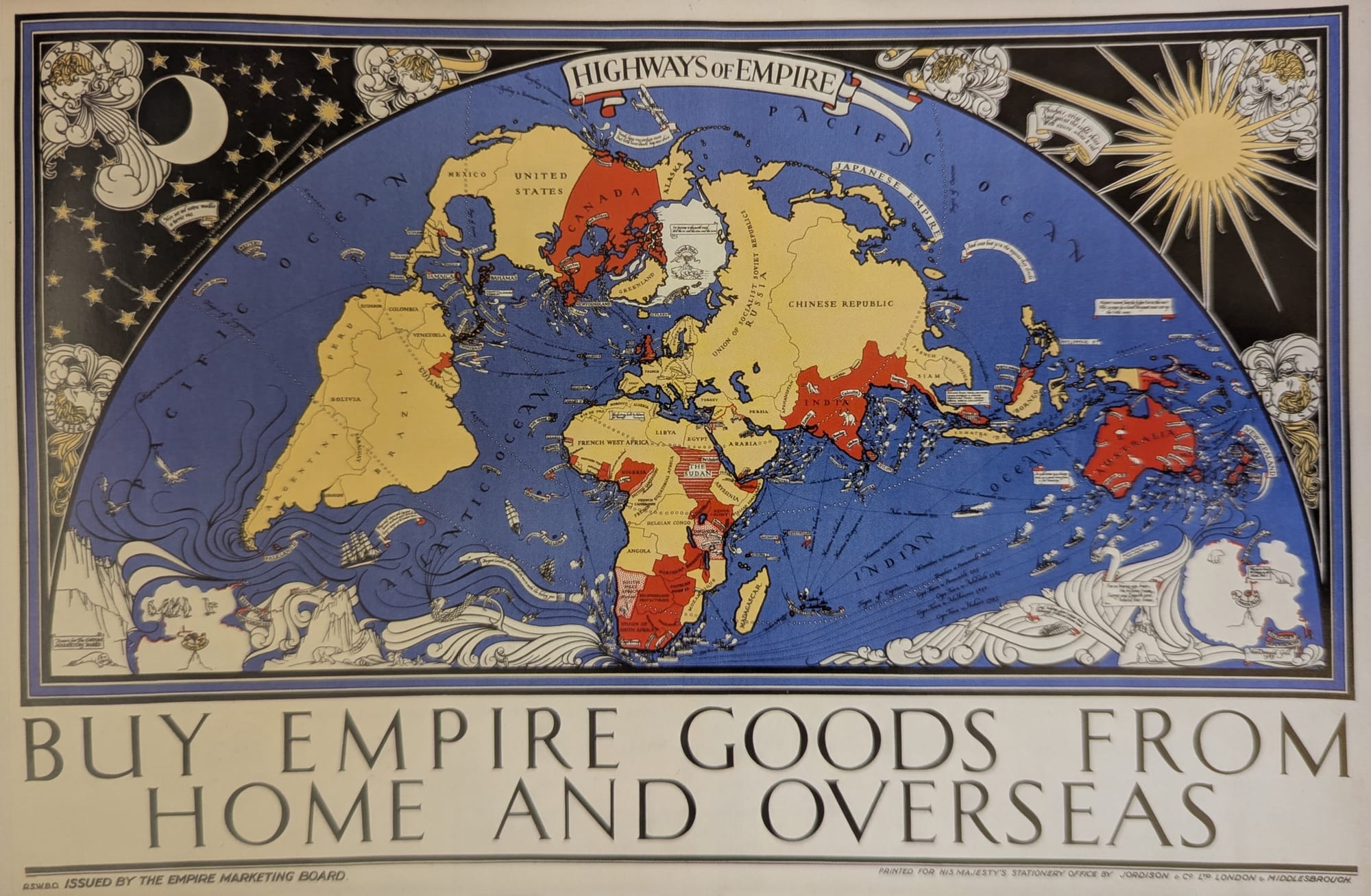
Search online now for ‘world map poster’ and you will see the extent to which their call has been heeded. It seems that cartographers, whose job is generally to produce the right map for the task in hand, probably bear less guilt for the overexposure of the Mercator projection than the publishers and propagandists who have continued to use it for general depictions of the world, even though many equal-area projections were available—or to adopt other insidious projections in which the equator appears two thirds of the way down, so that the northern hemisphere appears to constitute most of the world’s surface. These projections solve the problem of an oversize Greenland and an infinitely large Antarctica, which ‘look wrong’, while continuing to inflate the rich world and shrink the poorer parts, which of course looks fine.
Meanwhile, a variant of the Mercator projection has proved much the most convenient way to create flexible, zoomable digital maps, and has been adopted for Google Maps and all its main competitors. Squashed representations of Africa would appear to be here to stay, and maps that represent land area in less misleading ways will no doubt remain confusing novelties for some time to come.
None of this has much bearing on the question of whether to use a paper map or a smartphone app for recreational walking: at least, not unless the recreational walk in question takes you across entire continents, or to the high Arctic or central Antarctica, where standard Mercator projections become largely useless. [1] But it’s a reminder of how, at a social and an individual level, we are liable to go wrong when we take a navigational tool with a specific purpose and begin to treat it as an objective representation of ‘how things really are’.
There are countless ways of getting wrapped up with preconceptions that colour the way we experience a landscape: looking at a map is just one of them. Hearing about a place or a route from someone else, or following written directions, or looking at a landscape that’s famous for its beauty: all of these will shape our perceptions. [2] But the influence of a map is both powerful and subtle: presumably because it has such a strong claim to objectivity and authority.
To be clear, I am not disrespecting this authority: that way anarchy lies. [3] But it gives rise to strange behaviour. Planning a walk, I have a version of the landscape in my head, built from white spaces and the bunches and squiggles of pink contour lines. Then I come to the crest of a ridge to see a view opening up; I consult the map again to identify the newly visible hills and rivers and roads, and adjust my perception of how important those features are based on the information in the map. A magnificent but nameless outcrop of rock might not look like much on the map: so I turn away from it and point out to my companions the less dramatic hump in the landscape that happens (so the map tells me) to be a Munro summit. Or the map tells me which ground is boggy and which ground is dry, and on some level I continue to believe it, even when my feet are soaking wet.
Politically, this is much less harmful than the collective decision, over the course of several centuries, to shrink Africa. But it might still be getting in the way of a bare and immediate attention to the world around me. I begin to wonder how it would feel to leave the map at home, and put my trust in someone else’s instructions, guided by a subjective experience of the landscape rather than a supposedly objective representation of it.
I think about the guidebook directions for a walk I once did in South Wales, which included the instruction “continue forward, past a lovely house.” At one point we passed a couple who were using the same guidebook: “Did you enjoy the lovely house?” my friend asked them. “Yes!” they replied. “Lovely, wasn’t it?”
That little interaction was the most memorable part of the whole walk, and we’d never have had it if we’d all just been using maps. We probably wouldn’t even have seen each other: they’d have had their heads buried in thirteen square feet of paper, and I’d have taken a wrong turn half a mile ago because the path on the ground didn’t match the landscape I’d built up in my head from the contour lines.
I wonder if it may be time to fold up my enormous map, leave it at home, and set off without it.
... which, coincidentally, is the subject of the next essay in this series. If you're not already a member, please sign up at the button below in order to receive it.
For what it’s worth, the Ordnance Survey uses a Modified Transverse Mercator projection for its maps of Great Britain: but with only one smallish country to map, distortion isn’t much of a problem. The scale on an OS map is out by about 2cm every 50m at the eastern and western extremities, in Suffolk or in the Outer Hebrides. ↩︎
I even have a maxim for moments of navigational confusion on walks: “if you think the map’s wrong, you are wrong.” ↩︎
The role of place-based utamakura in Japanese literary culture—the process by which a place or landmark becomes famous through poetry, and is then invariably viewed through the lens of the numerous poems that have already been written about it—might be a supercharged example of this. But that’s probably a digression too far. ↩︎
Sources and further reading:
On the history of maps, see Mick Ashworth (chief editor), The Times History of the World in Maps (HarperCollins 2014). Further examples of how maps have been used to meet specific purposes and shape perceptions can be found in Rose Mitchell and Andrew Janes, Maps: their untold stories (Bloomsbury 2014).
The Ordnance Survey has a clear overview of map projections here, and this site gives a much more in-depth breakdown of numerous different types of projection.
The text of the resolution of the American Congress on Surveying and Mapping can be found here.
Image credits:
- World map by Gerardus Mercator, 1569: public domain (Wikimedia Commons)
- Author's own
- Portolan chart, unknown author, early 14th century: public domain (Library of Congress / Wikimedia Commons)
- London Underground Railways map, 1928: © TfL from the London Transport Museum collection. Reproduced with permission.
- Poster issued by the Empire Marketing Board, 1927. Image taken from Rose Mitchell and Andrew Janes, Maps: their untold stories (National Archives / Bloomsbury 2014). Reproduced with permission. The link is to a Bookshop.org page: I receive a commission from any sale by this route.
- Web Mercator projection: image by Daniel R. Strebe, 4 Feb 2018, licensed by Creative Commons.